You may have noticed new covers for the earlier books in the series starting to appear in the blog’s sidebar and on Amazon. That’s not all that’s new …
 The House in the Old Wood

The House in the Old Wood has been completely proofread again.
I’ve also added mentions of all the other books in the back, which are links in the Kindle edition.
But the biggest change is in the typeface for the paperback. I switched from Garamond to Palatino Linotype. I used Palatino Linotype in Book 3, The Hall of the Prophetess, and found it much more legible. It was especially helpful in the italics. With all of Karia’s thoughts in italics, it was important that they be clear. And Garamond wasn’t cutting it.
Part of the reason Palatino Linotype is more legible is that it is larger. (I don’t really understand how one typeface can be so much larger than another at the same size, but …) And that means the book has more pages now. And that led me to abandon the convention of having all the chapters start on the right-hand page. I’ve taken out all the blank pages within the book.
 Karia’s Path
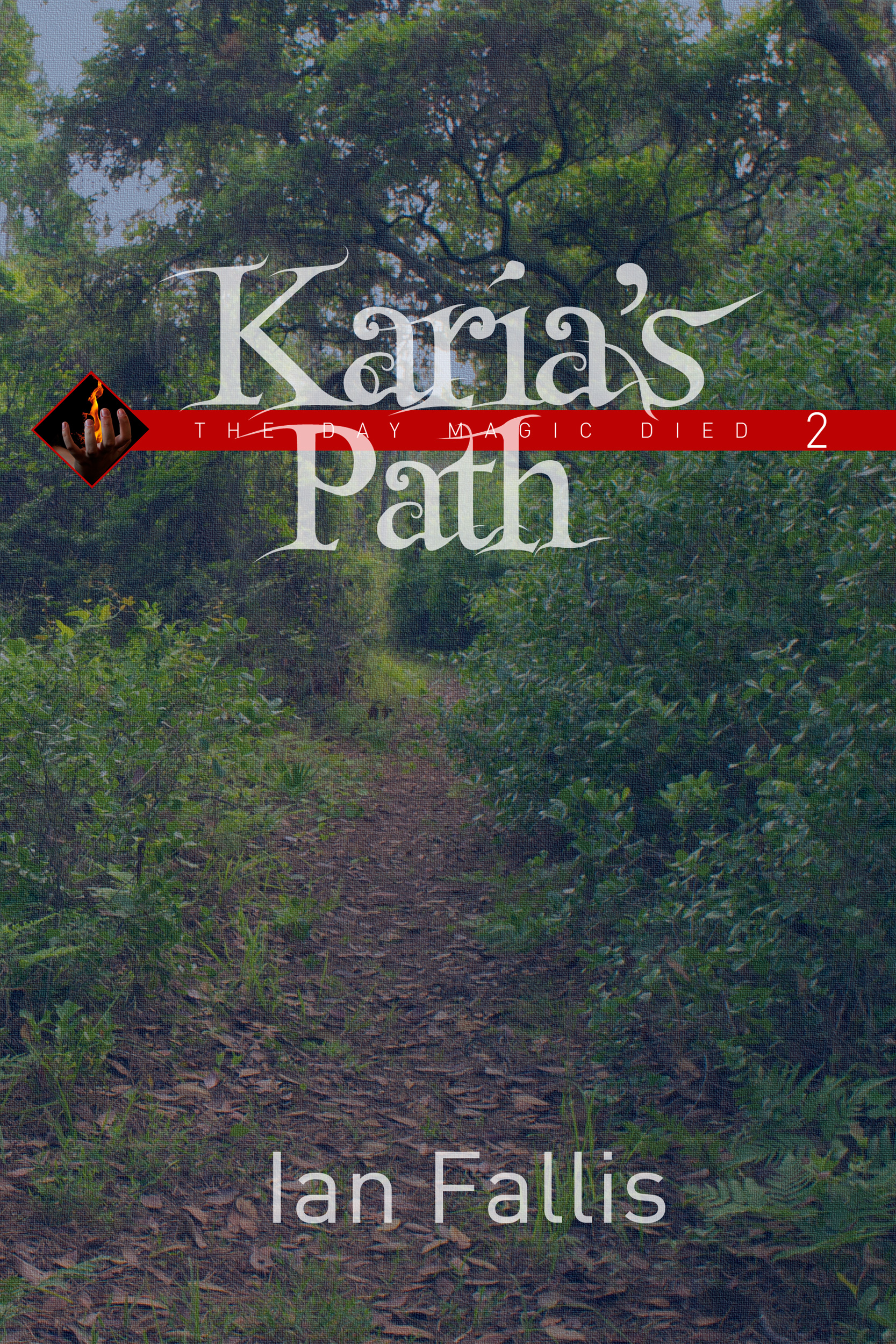
Karia’s Path has also been completely proofread again. As with The House in the Old Wood, this resulted in very few changes.
This new version also has the other books listed in the back, and linked in the Kindle version.
And like The House in the Old Wood, the paperback version makes the switch from Garamond to Palatino Linotype, for better legibility, especially in the italics. And I took out all the blank pages caused by trying to start each paragraph on the right page.
 The Hall of the Prophetess
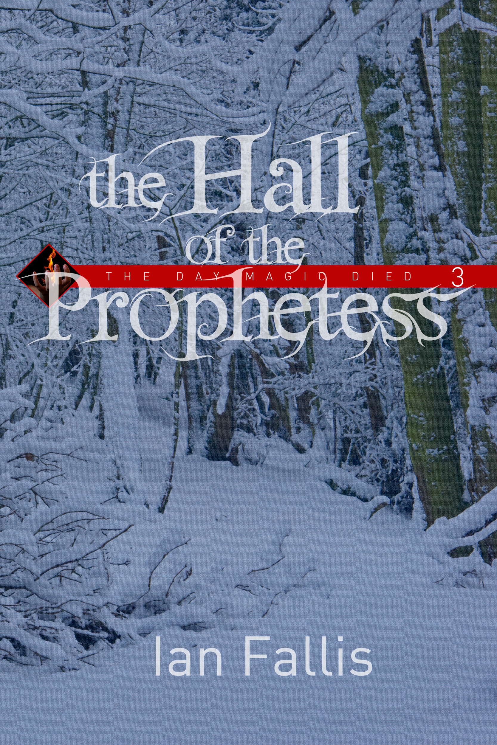
I’m a little embarassed to admit this, but I apparently rushed a bit too much to try to get The Hall of the Prophetess out last November. Another round of proofreading revealed more typos and issues than the previous two books.
Perhaps that can be excused by the fact that most of the issues had to do with the way one of the characters, Ni’ika, spoke. We found — and corrected — several inconsistencies in her use of pronouns — or lack thereof.
Since this was already in Palatino Linotype, the only other substantive change was adding the listing of the other books in the back.
Speaking of fonts
Since I brought up the subject of the font for the interior, some font junkies may want to know more about the cover fonts.
The back cover text is primarily Palatino Linotype — hey, when you find something good and legible, you stick with it!
And speaking of good and legible, the secondary font all over the cover is DIN, a legible classic that’s made quite a comeback.
The title font is Fairydust by Marcel de Jong. I think it works fairly well in the titles, but it does tend to look a little busy. It seems to work better as a drop-cap, which is how I used it on the back covers, both the originals and the new ones.


Recent Comments